Make Your Mark with Banner Images: A Social Media Artform (Nov 23)
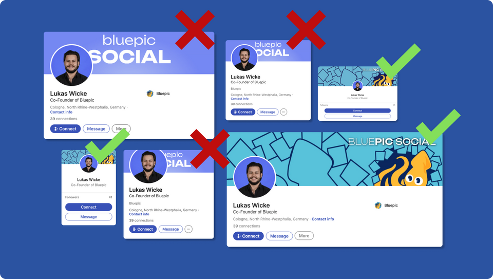
Ever felt like your social media banner was playing a game of hide-and-seek? Well, you're not alone. When your banner is the red carpet to your virtual persona, things can get a bit... unpredictable.
Understanding Banner Basics
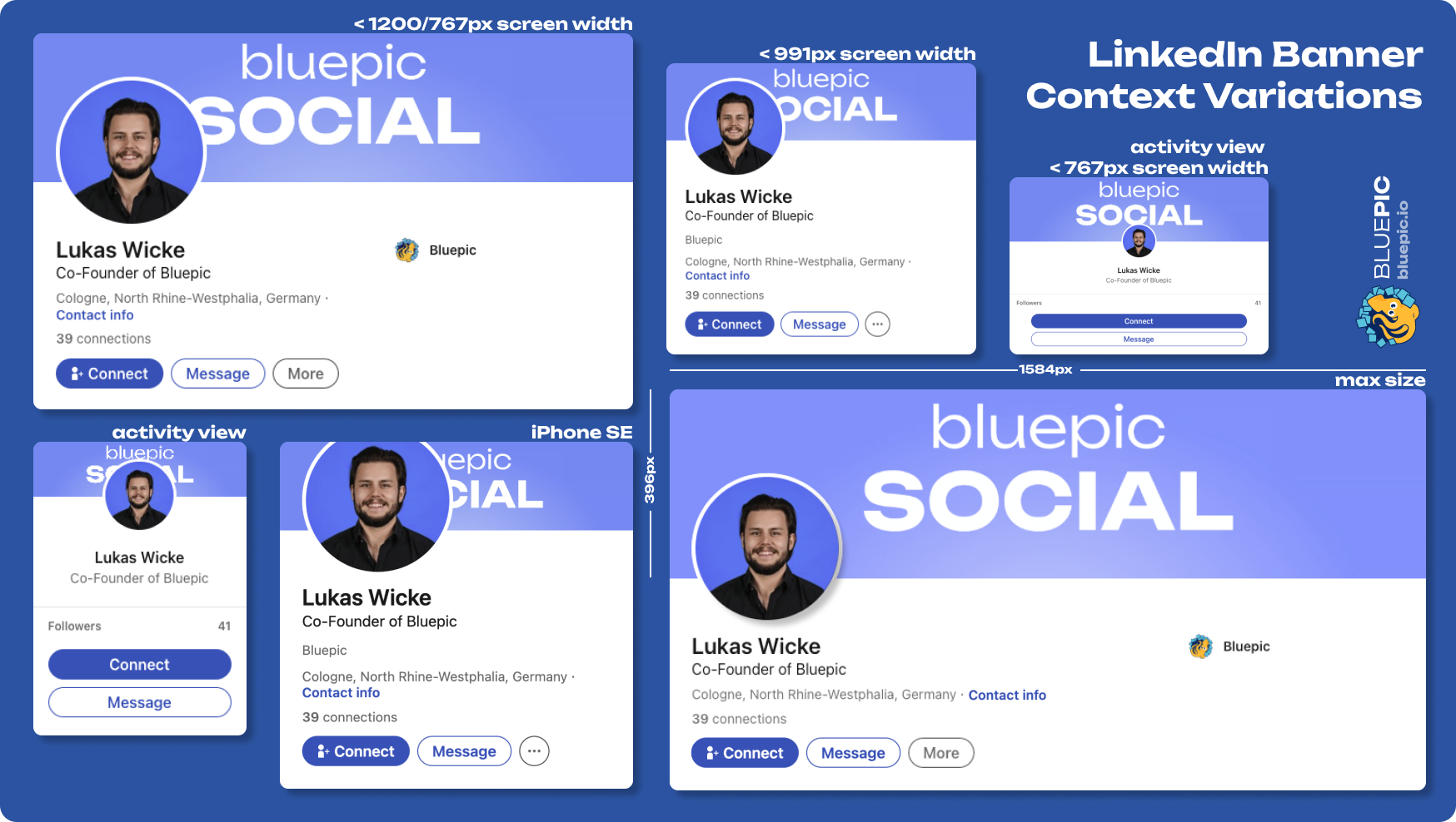
The banner image is your social media's crowning glory, but it's a crown that often sits on a very fidgety head. Whether it's a Facebook cover, a Twitter header, or a LinkedIn banner, these images aren't just pretty backdrops; they're strategic billboards for your personal brand. But there's a catch: different devices and layouts can play tricks with your design, sometimes hiding the very elements you want to flaunt. Let's start by understanding these digital chameleons.
Navigating Profile Picture Overlays
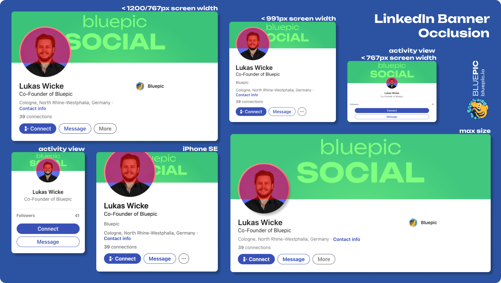
Profile pictures, those seemingly innocent circles or squares, can become the unexpected villains in our banner saga. This phenomenon isn't unique to LinkedIn; think of a Twitch banner or a Discord server banner where overlays can disrupt your design. This calls for a design strategy that outsmarts these overlays, ensuring that your banner's message isn't lost in translation.
Mapping the Occlusion Zone & Implementing Best Practices
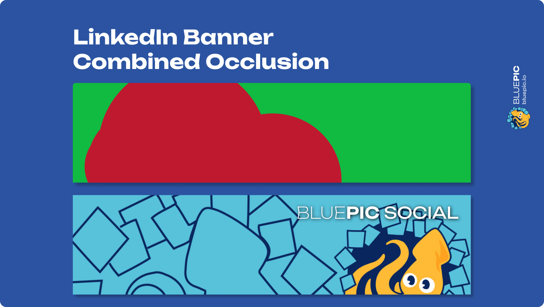
The key to outwitting these overlays? Know thy enemy's territory. By mapping out the "occlusion zone" - the areas where your profile picture might eclipse your banner - you get a blueprint for safe design. This red zone is a no-go for crucial information. Staying in the green ensures your banner's key elements shine through, no matter what.
With our map in hand, it's time to embark on the creative journey. This involves tactically placing text and essential visual elements in safe zones, harmonising the overall design with the profile picture, and keeping an eye on aesthetics. Our example banner is your compass, guiding you to design that is both visually appealing and occlusion-proof.
Creative Solutions for a Dynamic Platform
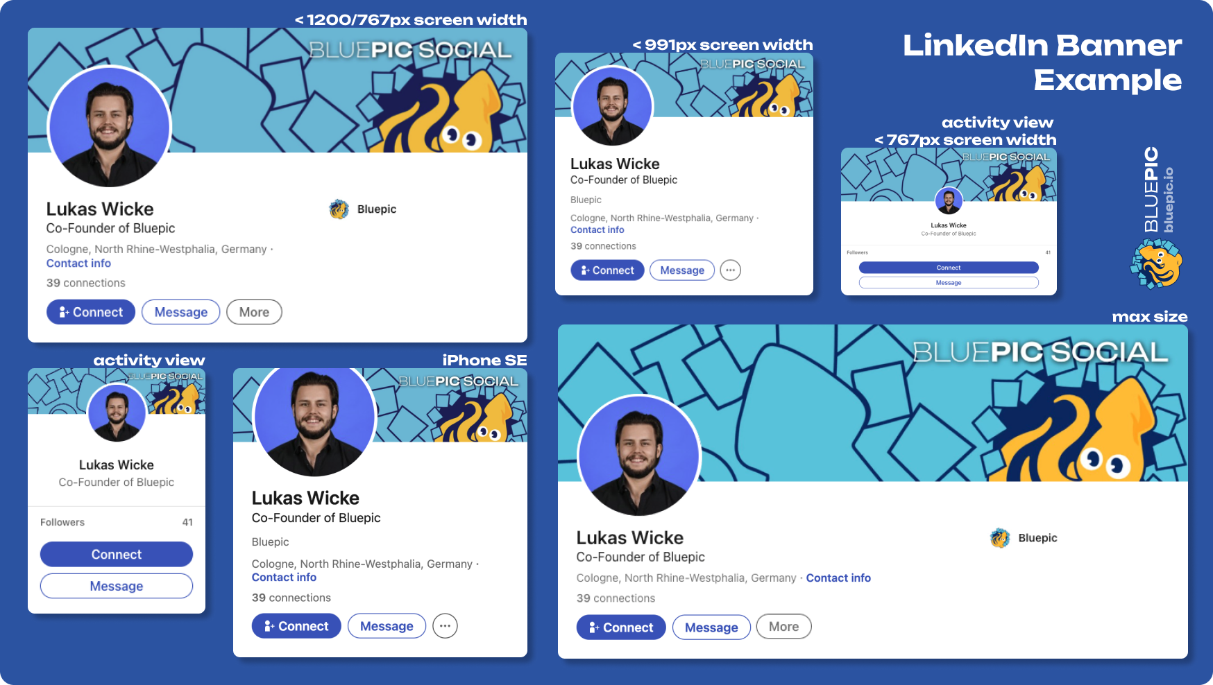
Social media platforms are ever-changing landscapes, and your banner needs to be a versatile traveler. Embrace the platform's quirks, experiment boldly, and remember: your banner is more than just a picture; it's a storytelling canvas. Let it narrate your unique story in a way that's both visually captivating and strategically sound.
Here's a little treat for you
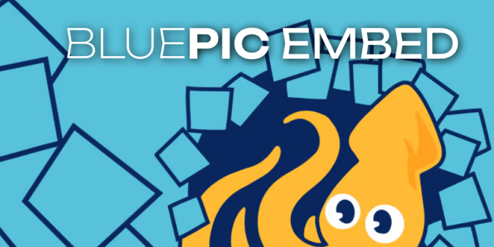
Explore the ease of banner design with our interactive graphics template, a prime example of the Bluepic software suite. This tool, specifically developed for seamless digital media content creation, showcases the innovative capabilities of Bluepic. Use it to effortlessly craft banners that are both visually stunning and strategically sound, navigating social media platforms with confidence.


