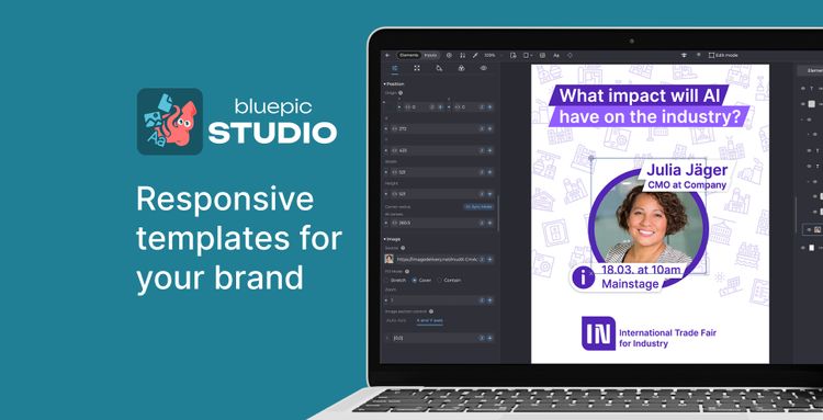
Say Goodbye to Rigid Designs
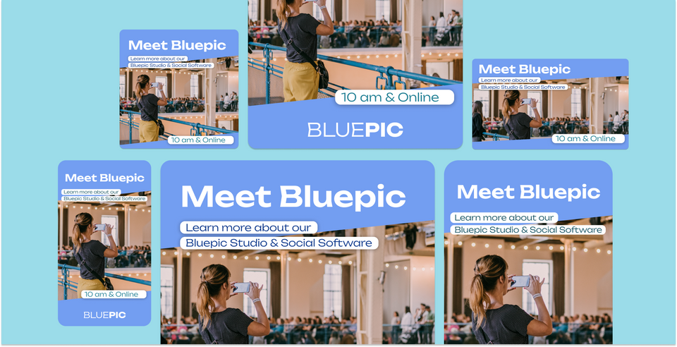
Learn how to Create Graphics That Grow with Your Content
When it comes to graphic design, one size does not fit all. The challenge lies in creating templates that can adapt to varying content types, sizes, and lengths. This becomes even more complex with a diverse user base, where many edge cases translate to numerous potential points of failure. In this blog post, we'll explore strategies to craft smart, adaptable graphic designs that stand out and withstand the test of variable content.
Embracing Flexibility in Layout Design
Designing with flexibility means thinking beyond the static. A smart layout is fluid, able to accommodate text and images of different sizes without losing aesthetic appeal. It's about creating a balance where elements can move and resize while maintaining the integrity of the overall design.
Leveraging State-of-the-Art Design Software
Modern graphic design demands cutting-edge tools, and Bluepic Studio is at the forefront of this revolution. It offers a suite of innovative features that empower designers to create adaptable templates effortlessly. From responsive grids that adjust to content variations to dynamic text boxes that resize intelligently, Bluepic Studio simplifies the design process, making it an indispensable tool for designers who value both efficiency and creativity.
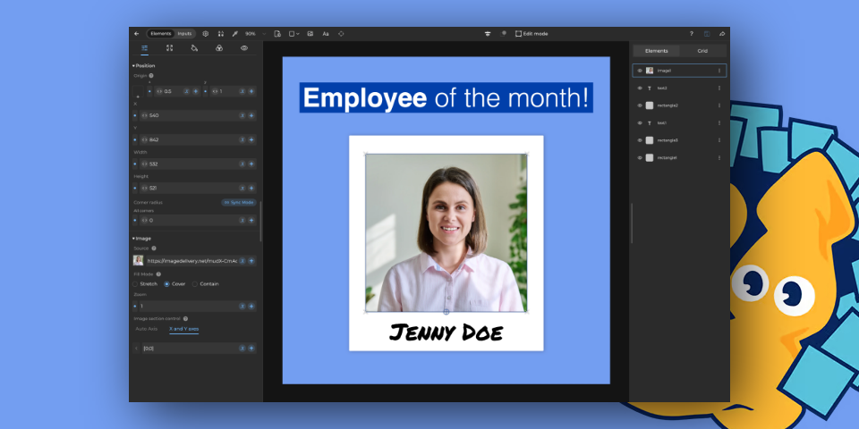
Ensuring Sufficient Contrast Between Layers
Wherever color or images change in your design, maintaining contrast between layers is crucial. This ensures readability and visual impact, regardless of the content. High contrast not only grabs attention but also makes your design accessible to a wider audience.
For example: Background images can be dark or light. Make sure that the foreground works in both cases.

Adaptive Typography for Dynamic Content
Typography is an essential element of design. Choosing the right typeface and size that can adapt to different content lengths without compromising on style or readability is key. Dynamic typography ensures your message is delivered effectively, no matter the content.
Testing and Feedback – The Final Touch
The final step in creating a versatile graphic template is testing and gathering feedback. This process helps identify any potential issues and ensures your design performs well across various use cases and content types.


