How to be a great template designer...
Hi 👋
my name is Thomas, I am one of the co-founders of Bluepic and I have been creating all kinds of design templates with our tool (and others before we made Bluepic) for a few years now. I like to think that I have a unique experience when it comes to graphic design, because nearly all of the designs I make are meant to be edited hundreds or even thousands of times by thousands or even tens of thousands of individuals, some of which have no design experience at all.

I would like to share some of my practical experience in the form of a list of tips that might help you with designing your own templates.
1. You can't predict content
Long texts, short texts, one-liners, two-liners or drölf-liners (that's a joke for my fellow Germans only), bright pictures, dark pictures, pictures with really poor quality, pictures that are actually just a logo, logos with or without a background - the point is... you can't even predict the form-factor of the content that users enter or add to your design template.
People will always find ways to use your templates for something that you hadn't intended. Depending on your circumstances you can either embrace it and specifically design for flexibility or crack down on it by implementing smart limits on what can be edited and how. Both of those options can be achieved with Bluepic (sometimes even at the same time).
Limit what can be edited (but leave enough room)
Nearly all traditional design tools that you might choose to implement and share templates with are based on an old-school software architecture: A design sandbox with plenty of tools that let you add, edit or remove any and all design elements. A Template is simply a design file of which someone has sent you a copy with the explicit invitation to make edits. Whether you are using Photoshop, Powerpoint or Canva, the solution architecture is the same either way. When people hear the term Design Templates, they usually think of Canva, because even though it is not a purpose-built templating solution at all, its clever marketing people have managed to monopolize the term anyways.
The problem with this old-school solution architecture is this: You can't reliably limit what users are allowed to edit. Feature-wise the furthest these tools go is to let you lock layers, which in all of the tools I mentioned above can easily be unlocked again by the end-user.
So what you really want to do is use a software - like Bluepic - that was purpose-built for creating and sharing design-templates, because it has a whole array of features that give you control over what can or can't be edited. It's also way simpler for end-users (but more on this later on).
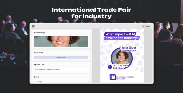
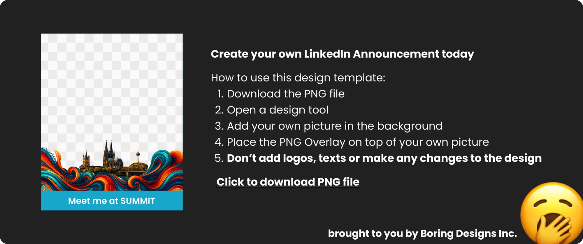
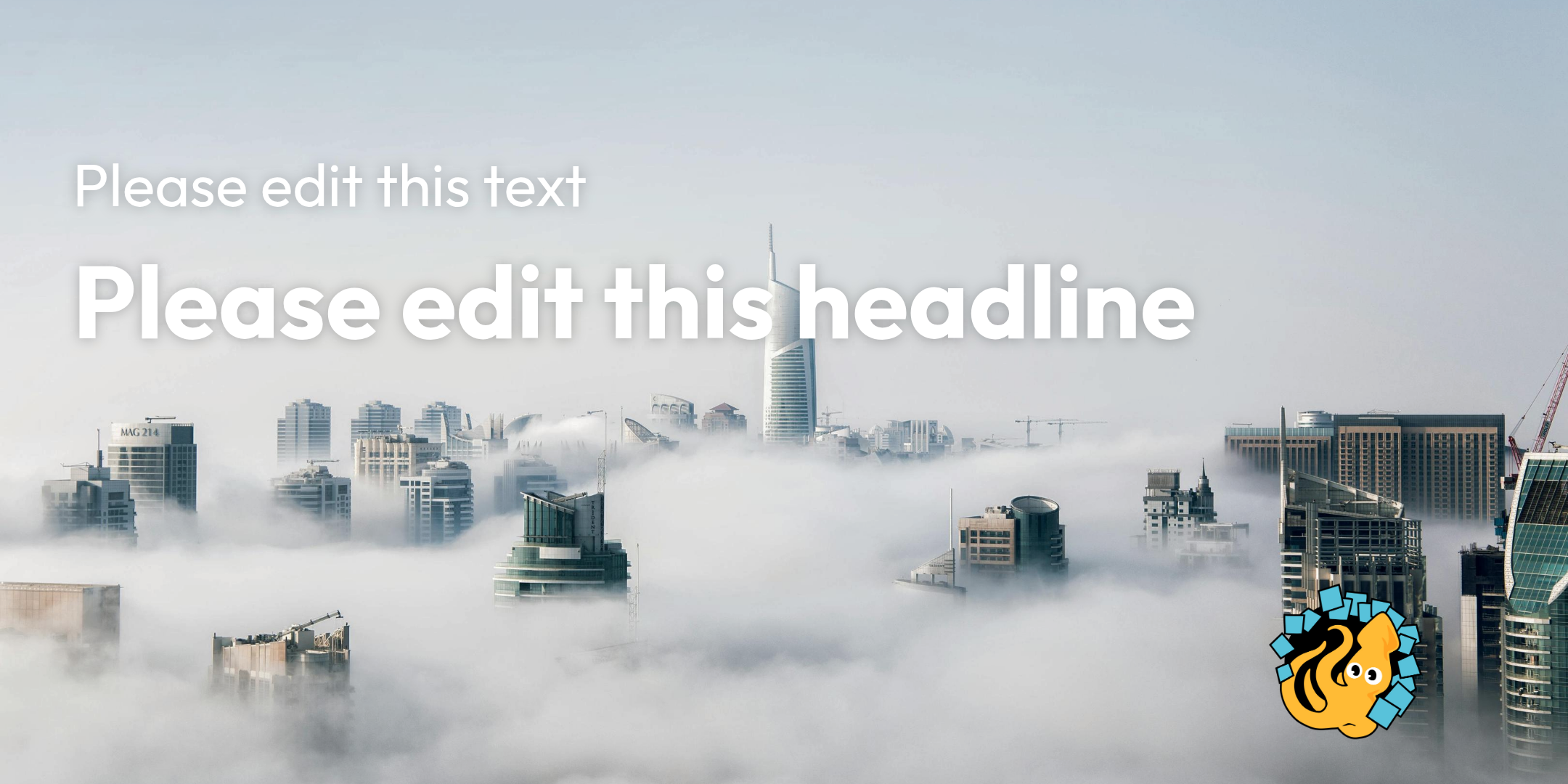
As an example, take a closer look at this Template-Widget that was made in Bluepic and is embedded below. The designer - me - has decided that...
- you can upload and crop a new image (but you can't edit its position or size)
- you can select to display or not display a button saying either speaker or exhibitor
- you can edit some of the text (but no linebreaks are allowed) but for the other part of the text you can only choose between two distinct options
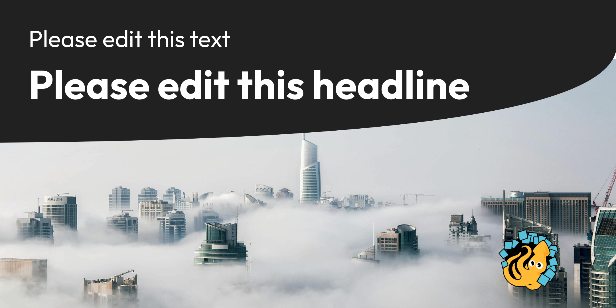
Limiting the editing options like I did makes this design fairly error-proof. People can't mess it up and so if I was the marketing manager of this design's ficticious event, I would have no problem embedding this widget right on my website for every attendee to use. While it might seem like I'm not really giving users any room for creativity, think of how restrictive a template design would need to be in Canva, Powerpoint or Photoshop, if you wanted to be absolutely sure that people can't mess it up. Here is what it would probably look like...
By using an error-proof templating solution like Bluepic I can set intelligent limits that empower people to be creative instead of relying on boring designs to prevent mistakes.
2. Images are rectangles with an unknown color
Touching on the whole theme of the previous section about the unpredictability of content: When it comes to images, just think of them as rectangles of every imaginable color. Here is a straightforward example of why that matters:
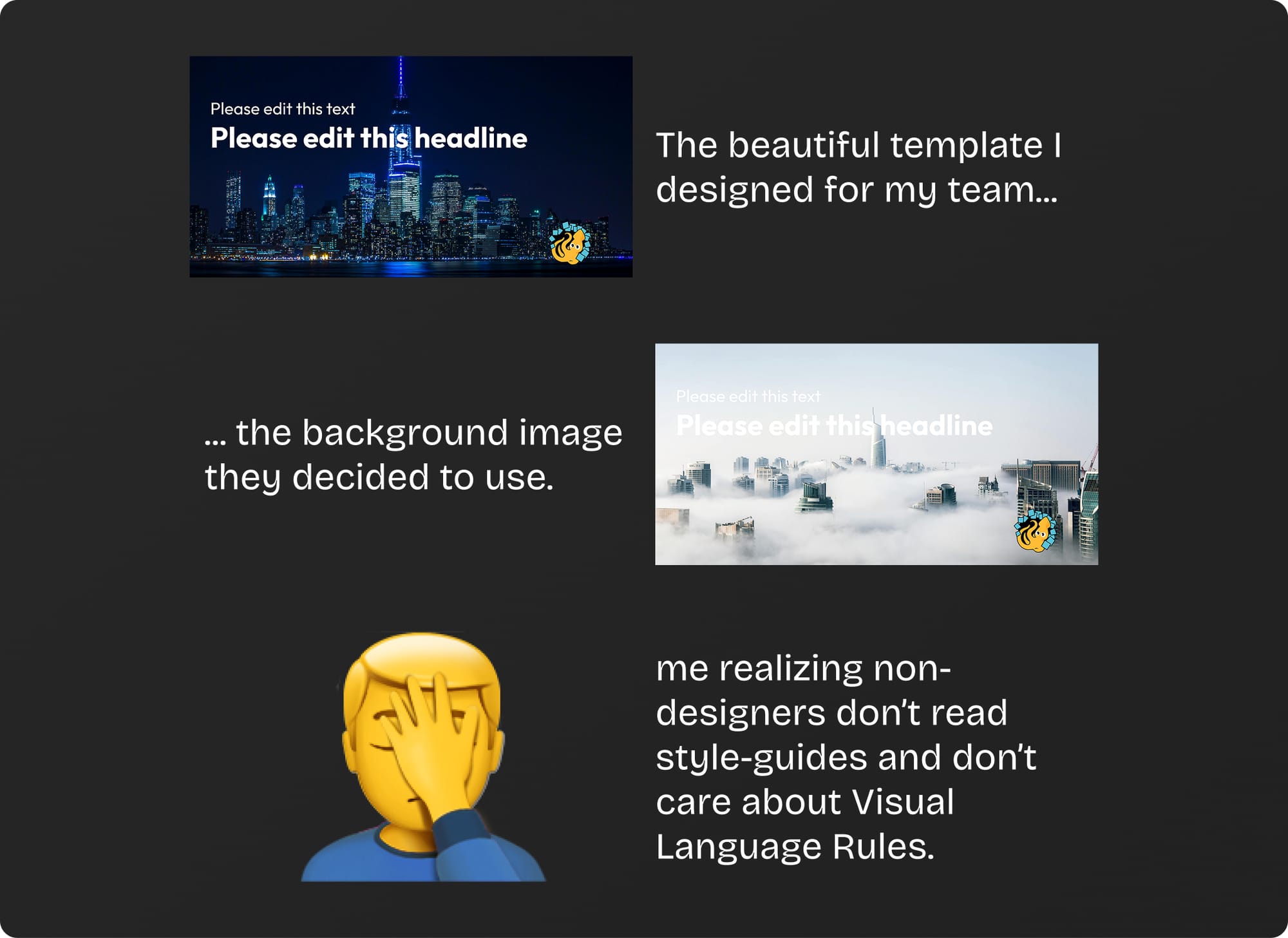
Designing Text on Images should always raise a red flag 🚩. A lot of corporate designs try to solve this issue with simple rules in their style guides like: "Visual Language: For background images always use a dark image, to ensure good contrast with the white font". Elegant solution, right?
Corporate Design Guides are made by professional designers and are meant for professional designers. People don't read it. They don't even skim it. They certainly don't care about it. But if you care about - maybe even require - people to create visual assets consistent with your brand identity, then you need to be smart about it, not elegant.
Here are my go-to solutions. Pick one and if you have an even better one, please e-mail me about it.
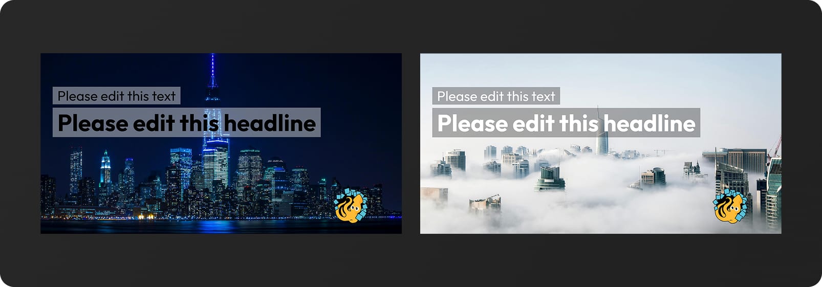
Background Rectangles
Works well for white text but doesn't look as good for dark text. For white text, I would recommend a black background rectangle with 30% opacity.
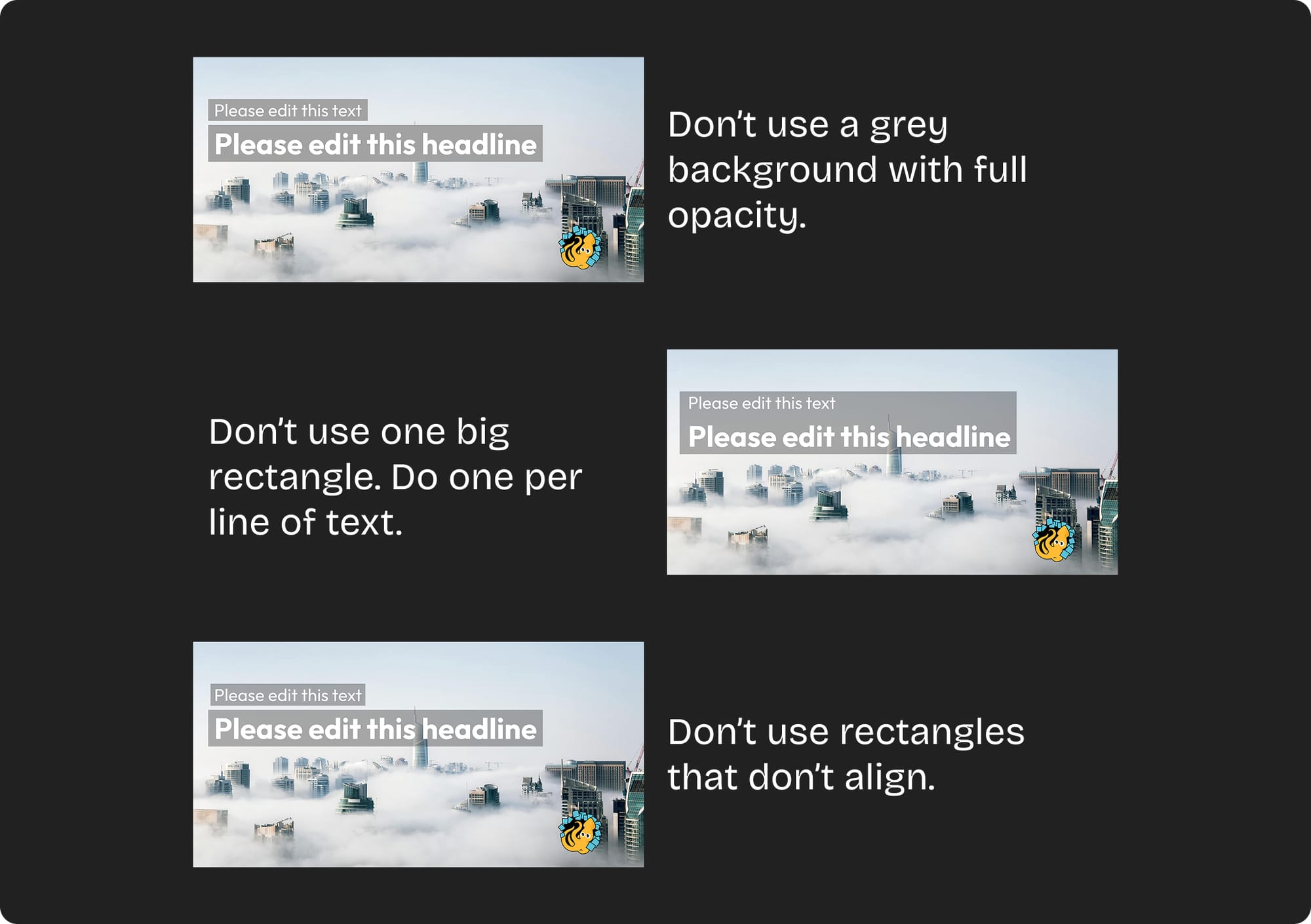
Here are a few variants which in my opinion do not look good:
Give users the option to manually adjust the image
Take a look at the template widget that is embedded below. One of the input fields on the left is a slider for manually darkening the image. Give it a try to see how a little darkening can fix the problem.
The only issue with this, of course, is the fact that it introduces a possible source of failure. What if your user just doesn't see the issue and forgets to darken the image... That's a judgement call you have to make.
Dropshadows
It has to be on the list of options, but I know a lot of designers who hate dropshadows with a fiery passion. Personally, I don't mind dropshadows at all. I use them frequently to solve this particular issue. It doesn't rescue white text on white rectangles but it can give you that little bit extra of safety with white text on slightly bright images.
Just go gentle on the dropshadow. Try opacities between 15% and 30%. I rarely go higher than that. Use as much blur as you need to soften the effect.
And last but not least...
Just avoid text on images entirely
You can always just stick to keeping text on a background of your own choice instead of on a replaceable image. It's obviosly the safest aproach but it can also feel boring and uninspired.
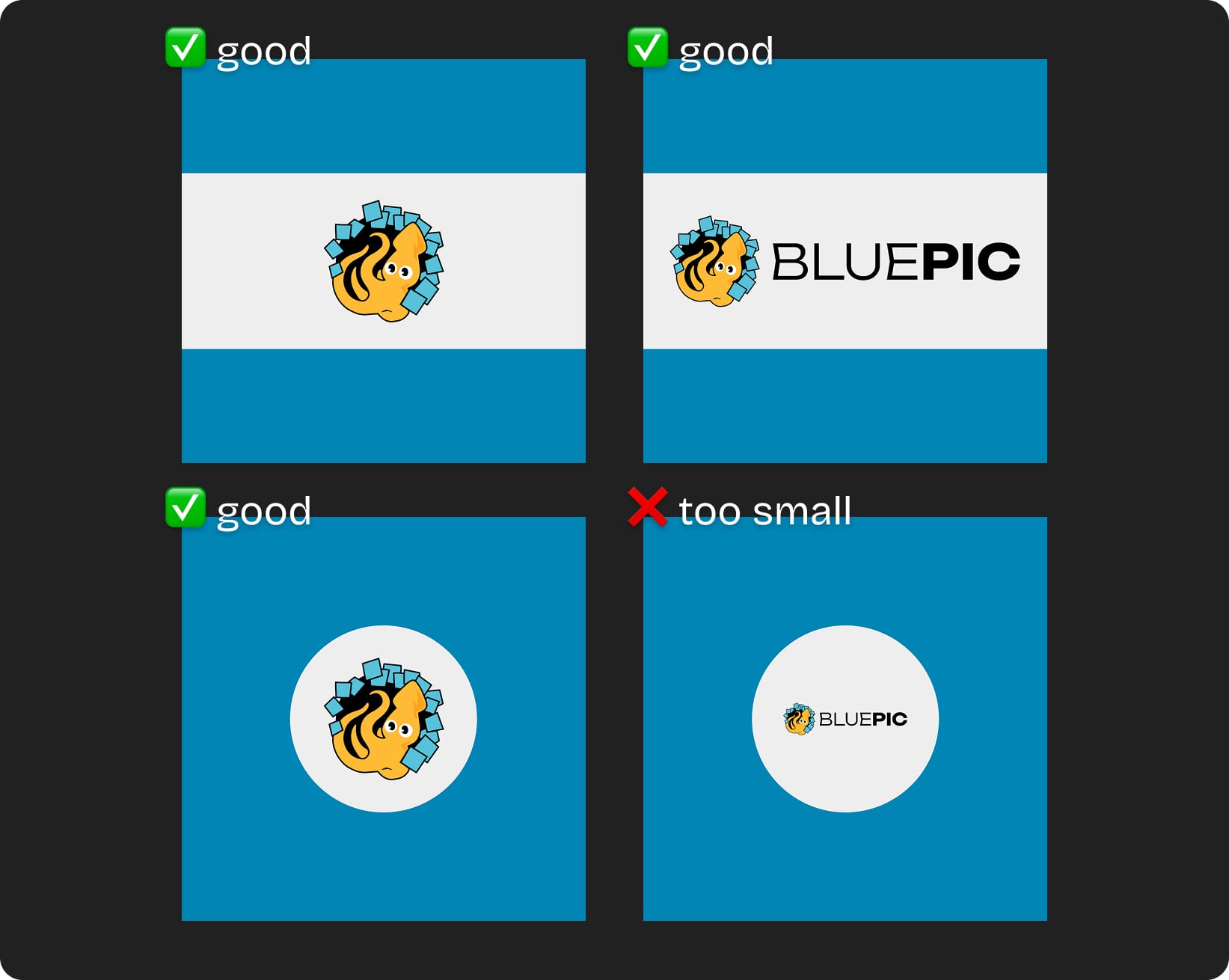
3. Logos only vary in width (not in height)
Well... sort of. Here is what I mean by that: Say you have a template design (maybe something like a poster) and somewhere on there you want to place a logo. The logo is one of the elements that your template's users will be replacing with their own and naturally you can't predict exactly what that logo will look like. I will always recommend taking a vertical stripe of your design and dedicating it (ideally the full width) to the logo.
The reason is that nearly all logos I have seen have a width to height ratio between 1:1 and 5:1. But very rarely have I seen vertical logos, i.e. something with twice the height than the width.
Set up your logo placeholder frame as a full width horizontal slice that centers and fits the content (in Bluepic this is the contain mode), and then almost all logos will look good, even the square ones. The same is not true if the placeholder frame is a frame (or a circle):
That's it for today. I will share more practical template design tips in future blog posts. Feel free to reach out to me, if there are any questions, feedback, counterpoints or if you want my support on one of your projects.
Until then...
- Thomas